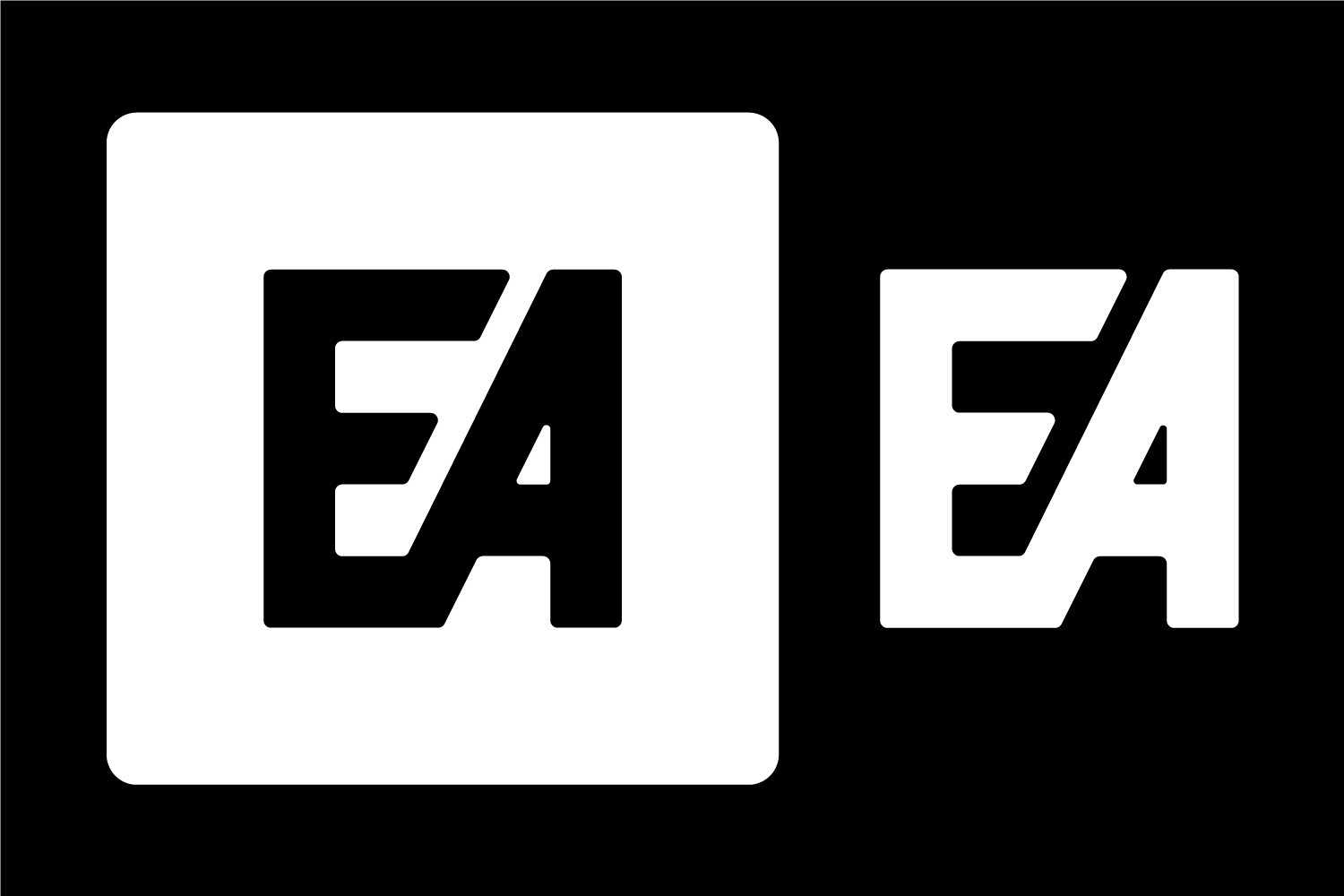
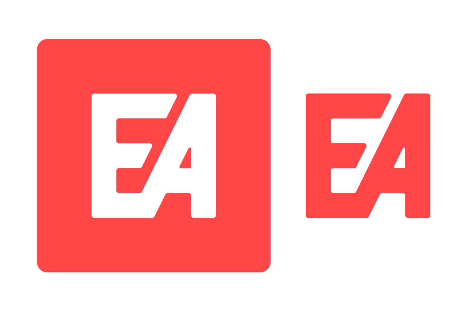
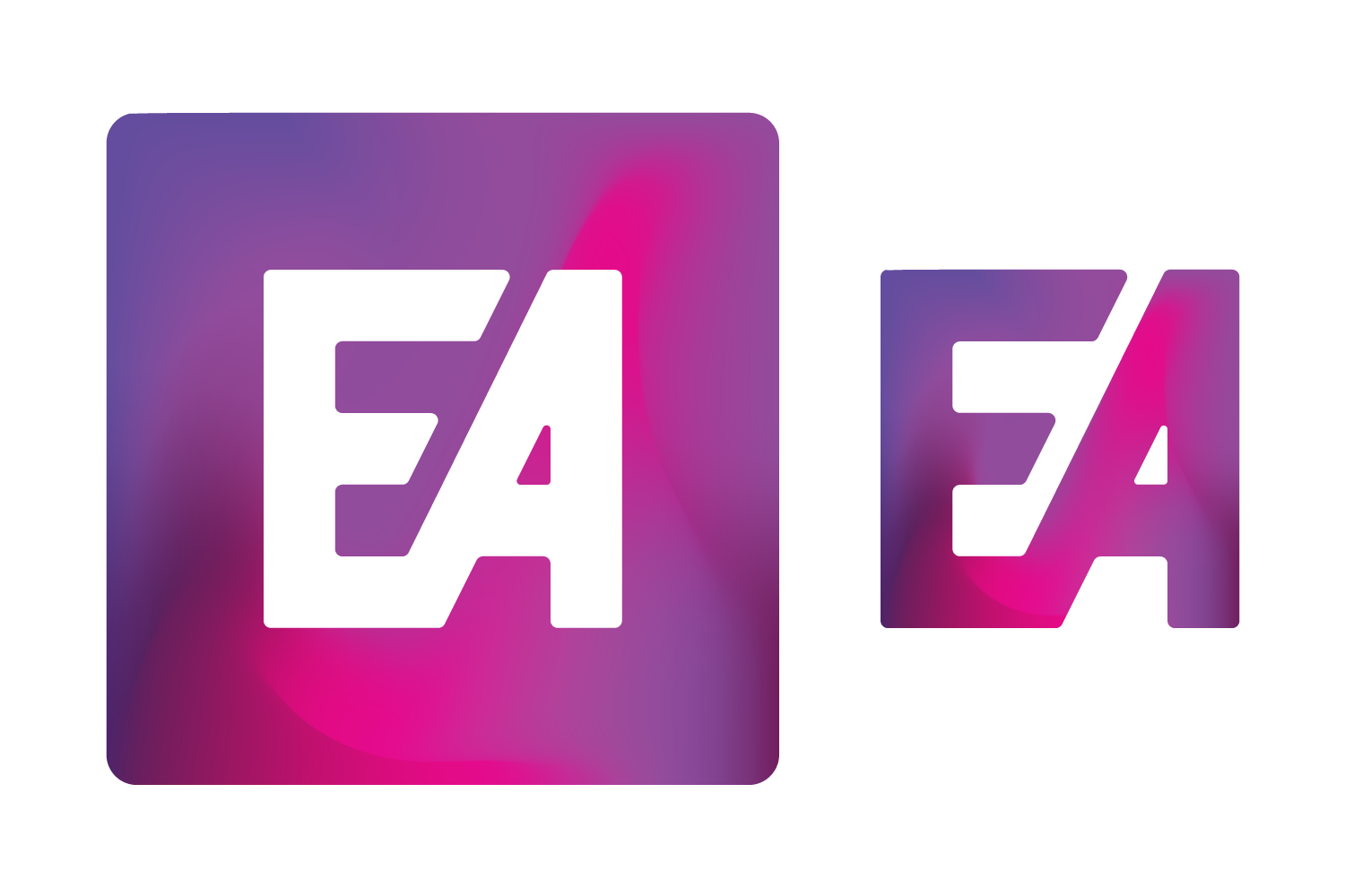
Electronic Arts Logo Redesign (Concept)
Had an idea that was buzzing around my head for a redesign of the classic EA logo. While a simple take on the original, this concept feel much cleaner than its predecessor.
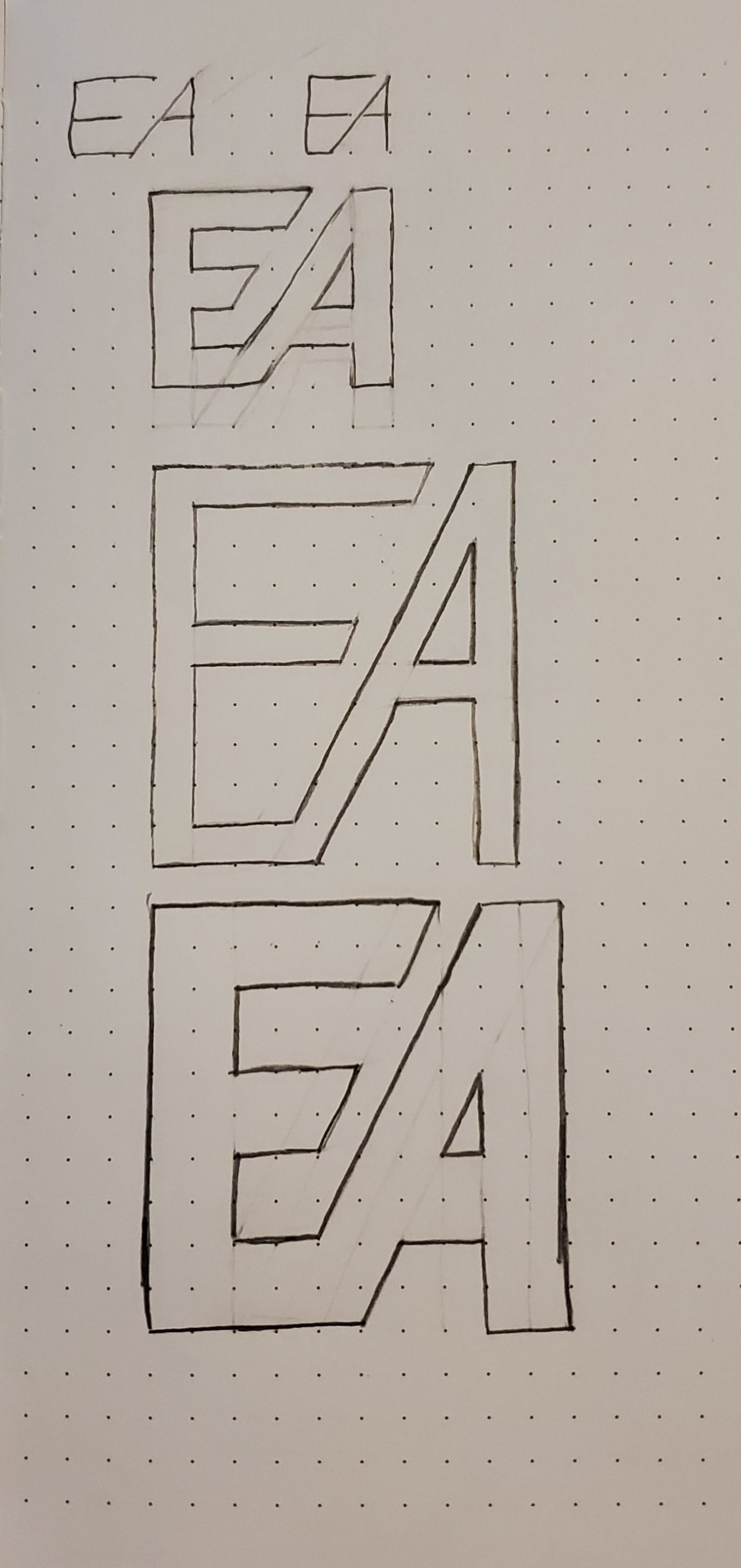
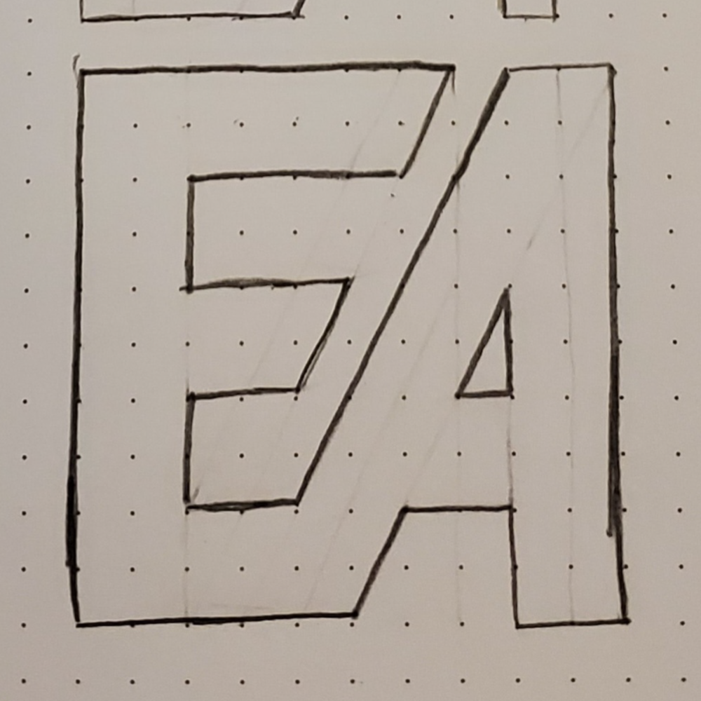
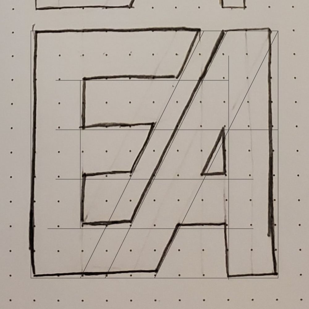
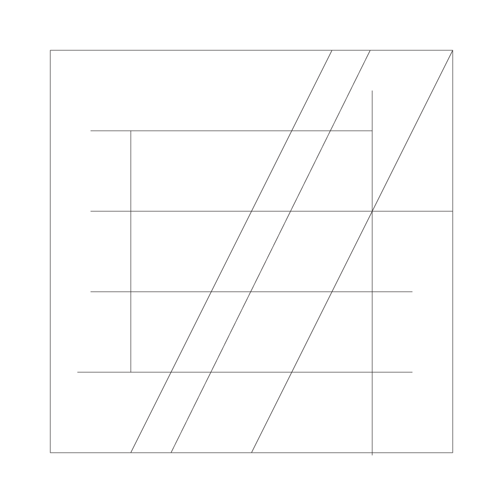


You can see the original sketches along with line work when going through & creating the vector logo. I went through a few different weights when sketches this out & settled on a heavier type for the "EA" letters themselves.
Decided upon trying the "EA" inside a box along with stand alone type. I followed this up by using the light red/pink color that is standard in EA's branding & the gradient mesh of the new "Electronic Arts" logo.
The final results are decently appealing & I'm quite pleased with how it turned out.
Decided upon trying the "EA" inside a box along with stand alone type. I followed this up by using the light red/pink color that is standard in EA's branding & the gradient mesh of the new "Electronic Arts" logo.
The final results are decently appealing & I'm quite pleased with how it turned out.

